Gather AI
Brand identity for the first AI-native telco operating system — built for humans and the agents acting on their behalf.

Art Direction
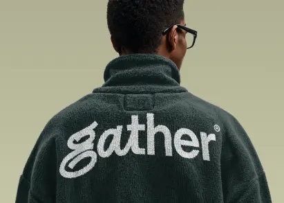
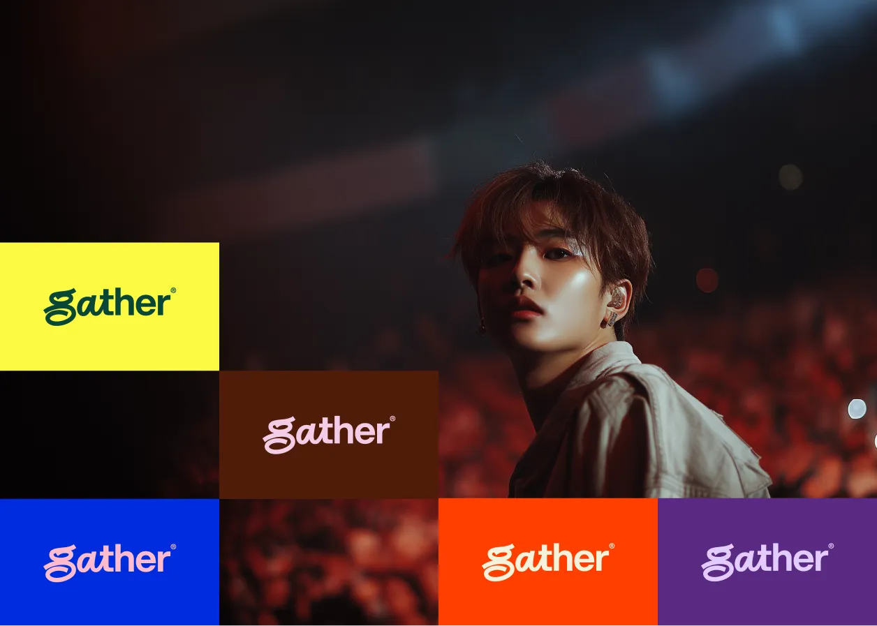
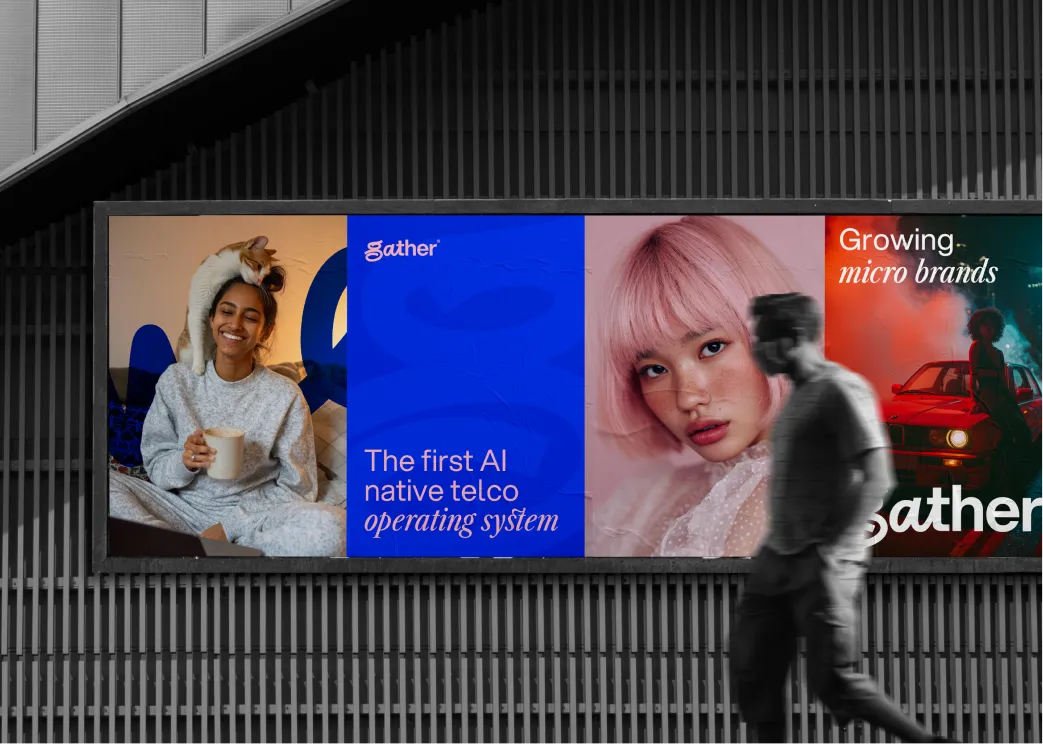
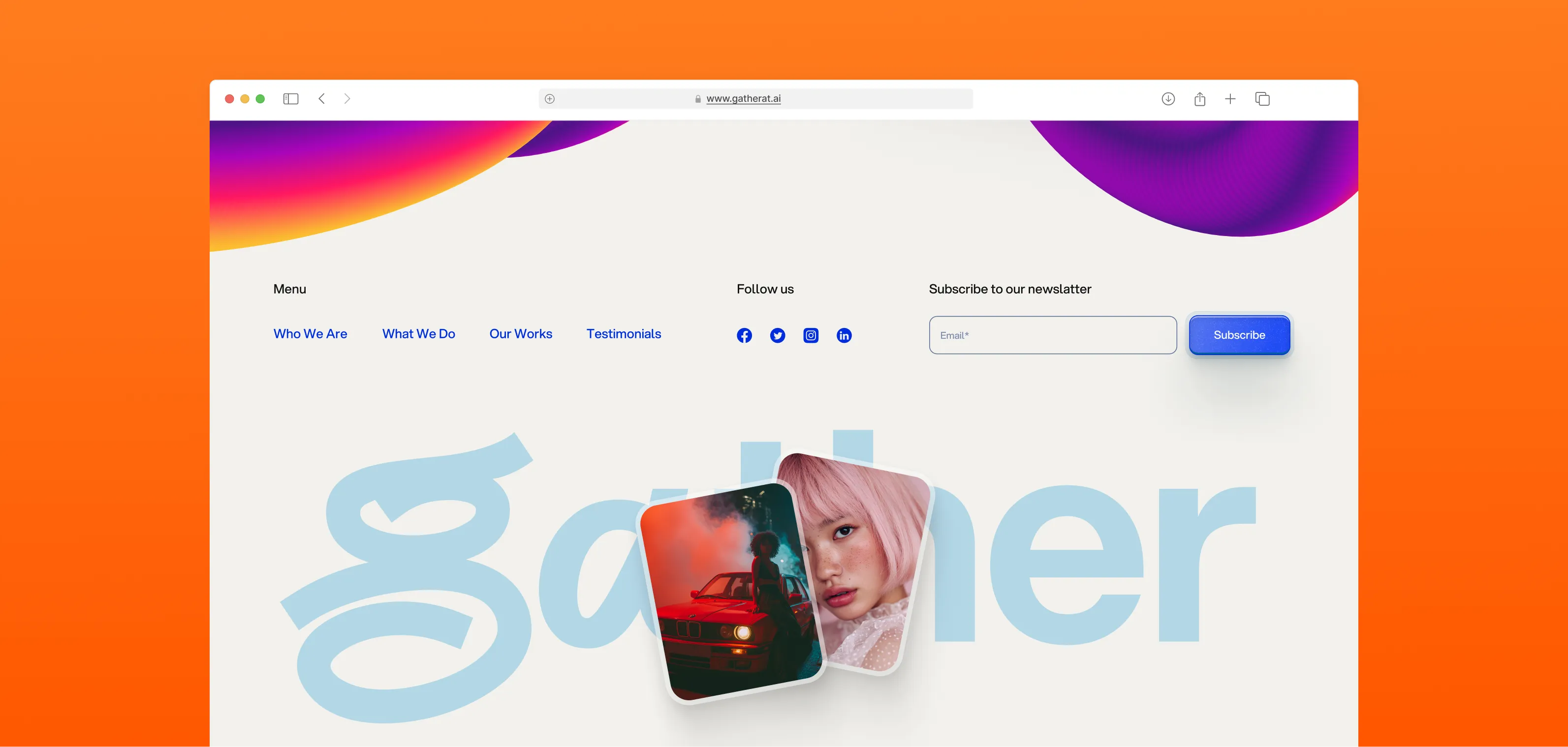
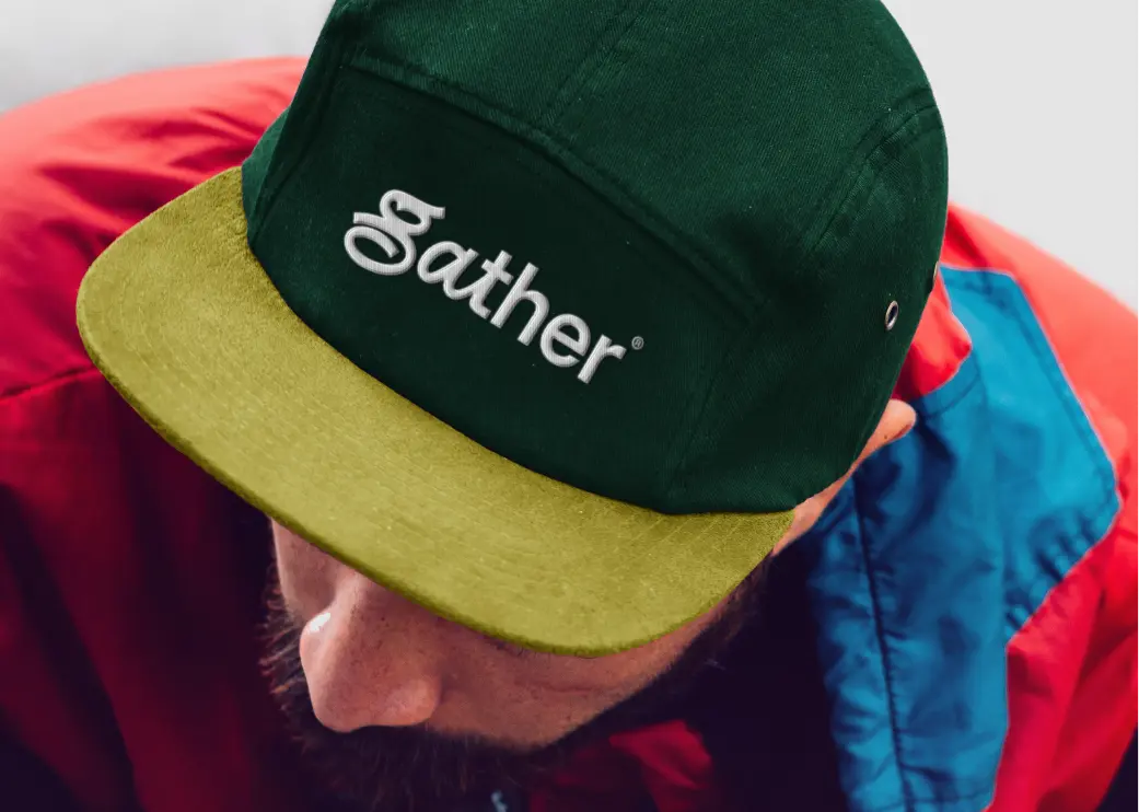
Gather is rebuilding a $2 trillion industry from scratch — so the brand had to feel like nothing that came before it. We went editorial and typographic: a dominant expressive "g" letterform, olive as the signature color, and a visual language borrowed from culture, not enterprise software.
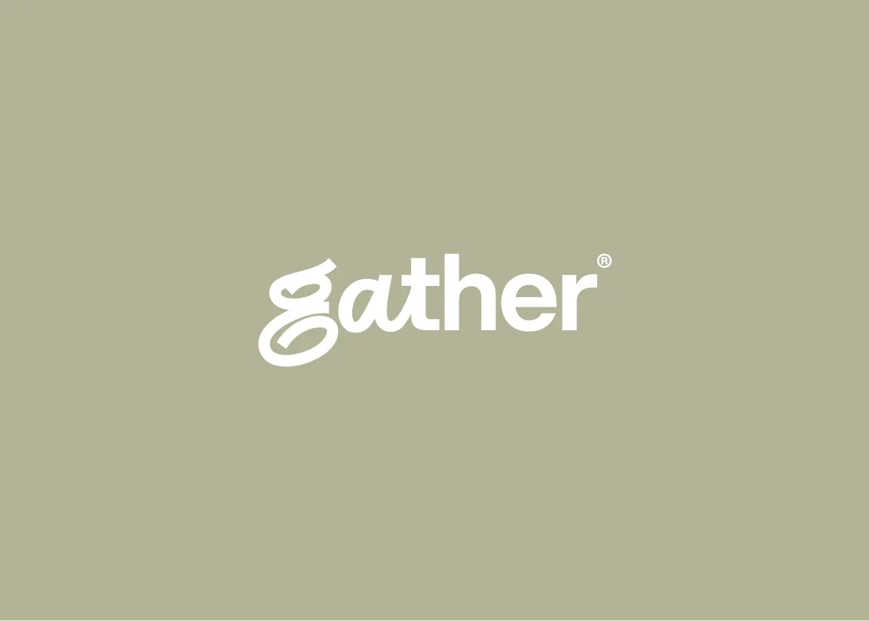
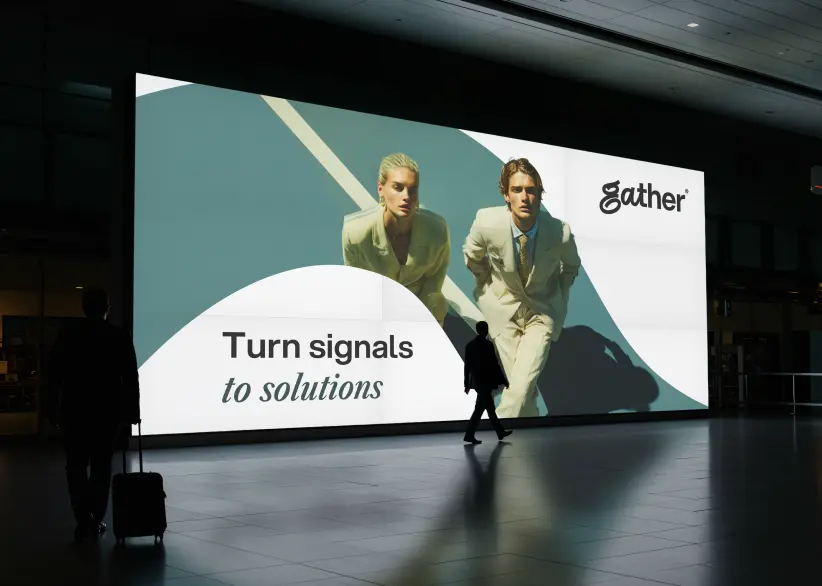
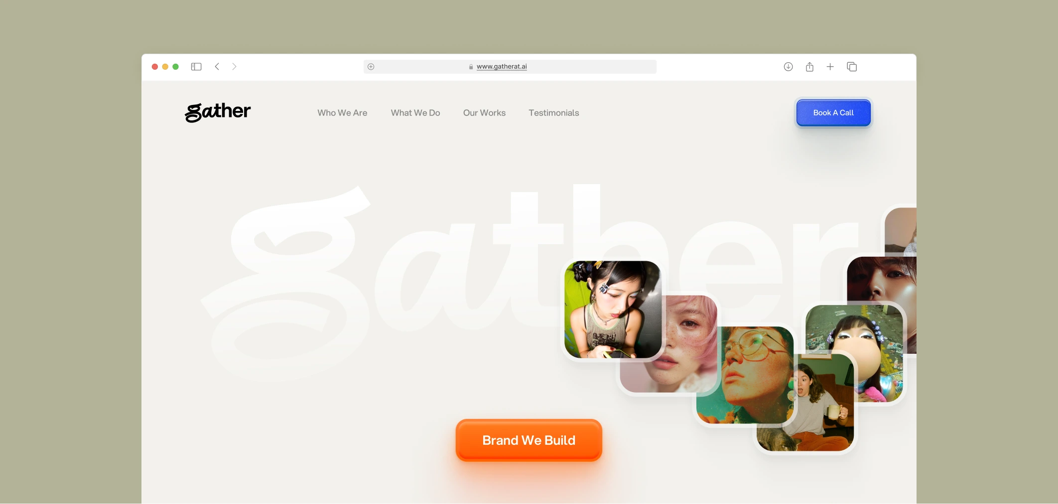
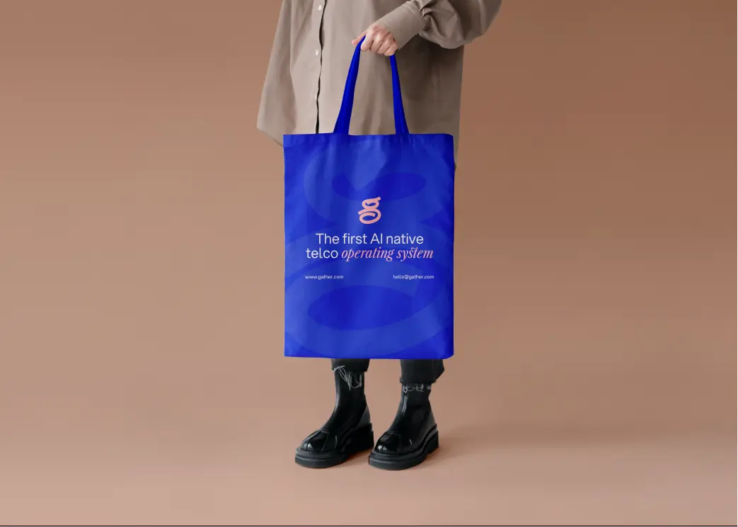
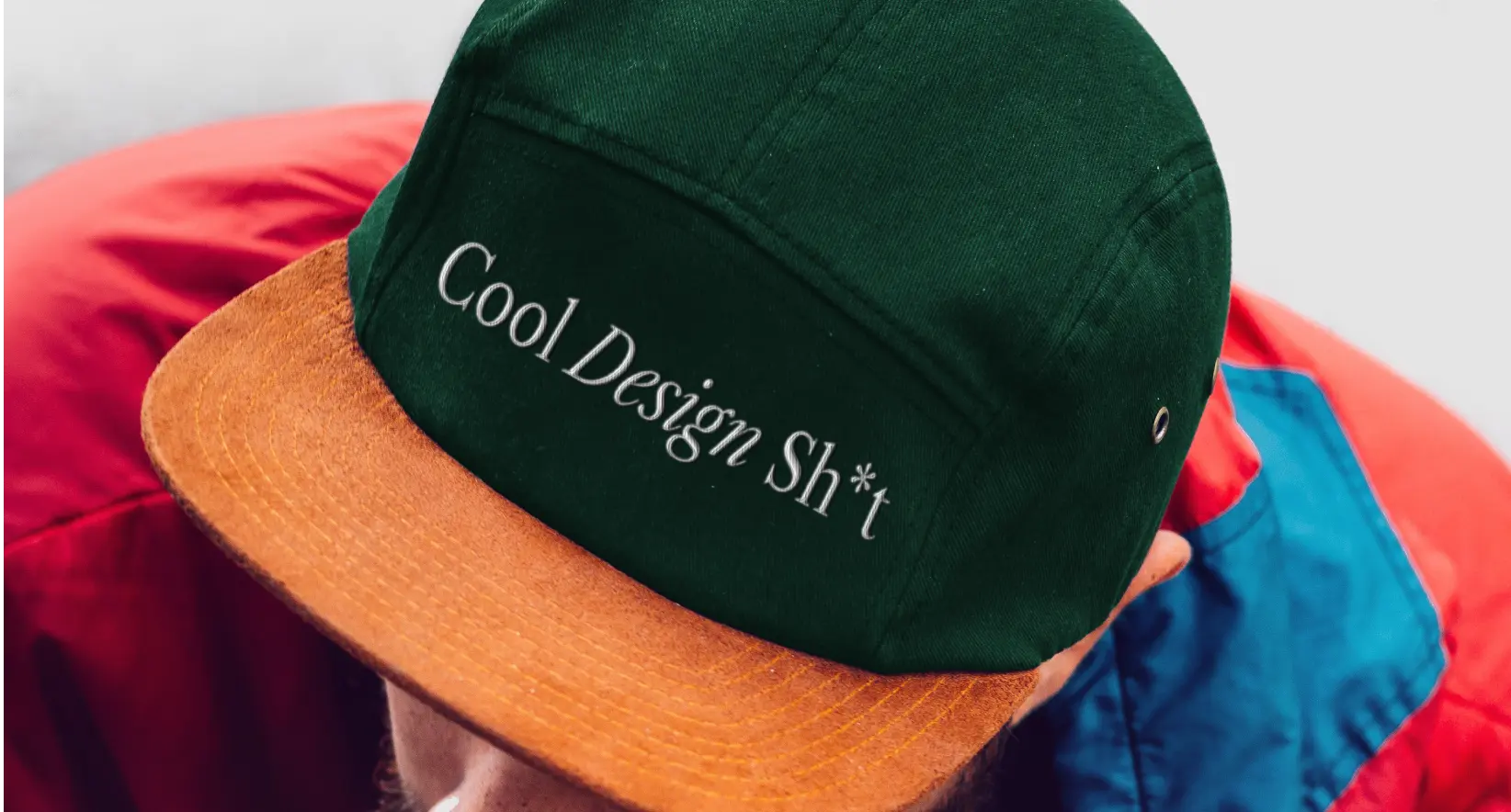
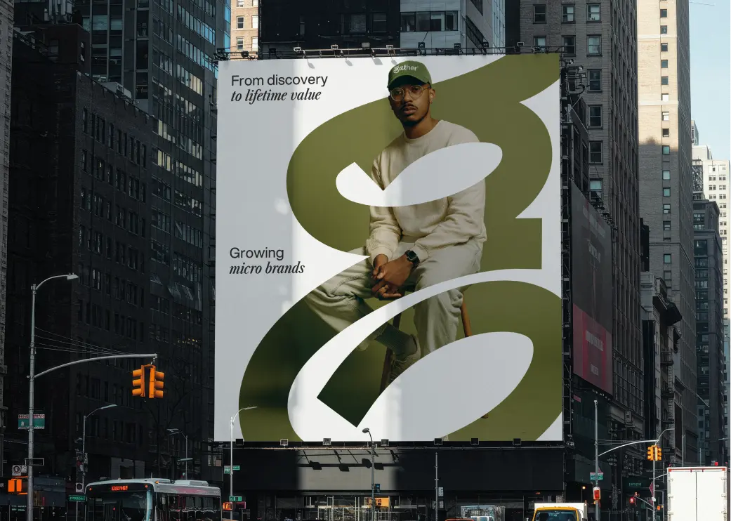
The oversized letterform does the heavy lifting — a single character that signals confidence, scale, and originality before a word is read. Set in motion across OOH, merch, and digital, it becomes a system rather than just a logo.
Olive green was a deliberate provocation in a category of blues and grays. It reads as considered, unconventional, and human — exactly what a carrier built for the agentic era needed to feel like to the developers and enterprises it serves.
Creative Process
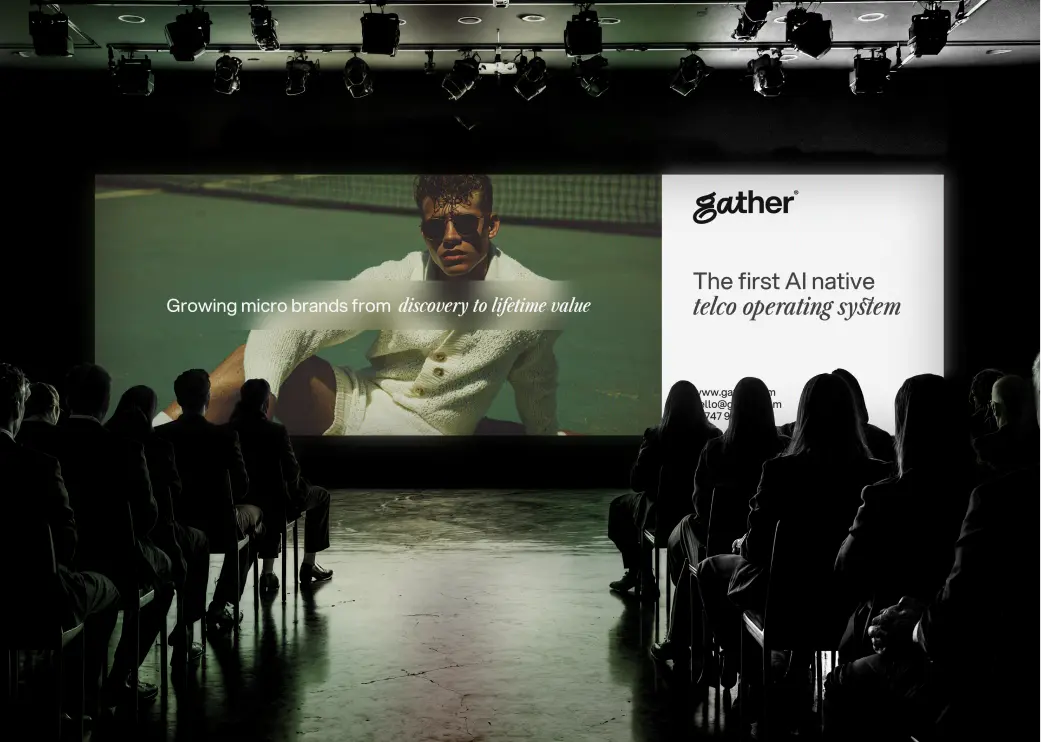
We started by asking a simple question: what should the brand of the last carrier ever built look like? The competitive audit confirmed the opportunity — every incumbent in telecom defaulted to the same cold, corporate visual language. Gather's brand needed to signal a total break, not an incremental upgrade.
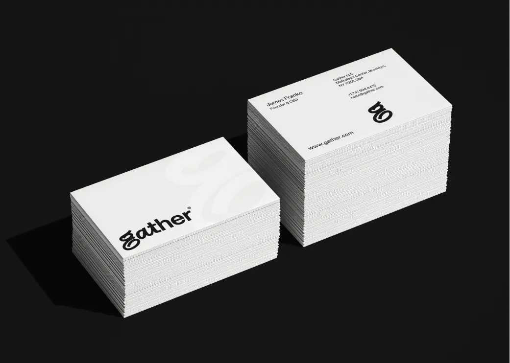
With direction locked, we built the identity system around the letterform — developing type hierarchy, color application, motion principles, and merchandise extensions in parallel. Every asset was stress-tested across developer-facing surfaces, enterprise pitch materials, and physical environments. Bold enough to own a billboard. Precise enough to ship in a UI.