Parker AI
Brand identity for the AI creative strategist built for DTC brands — turning Reddit threads, TikTok trends, and ad performance into winning hooks and scripts.
Art Direction
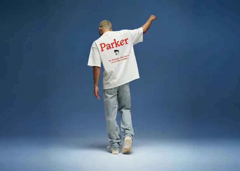
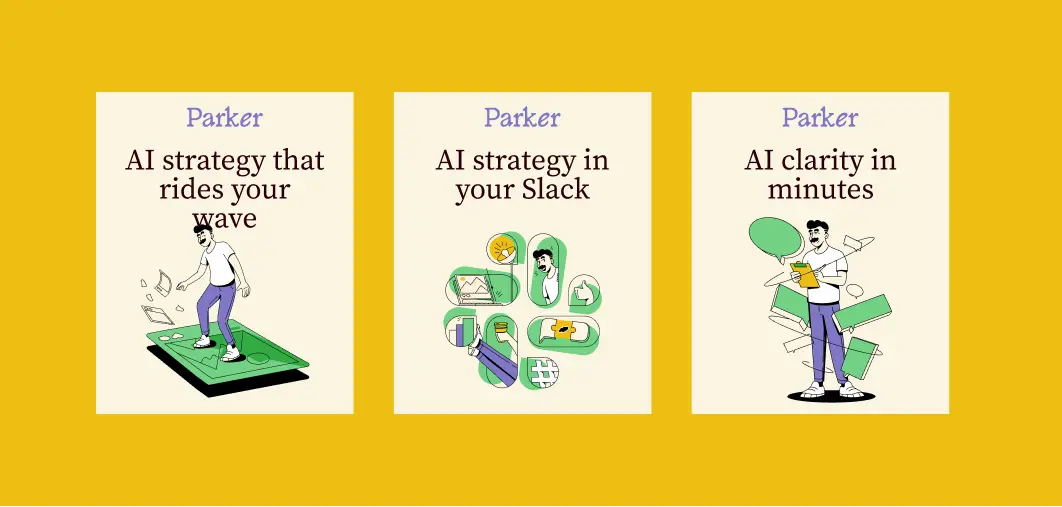
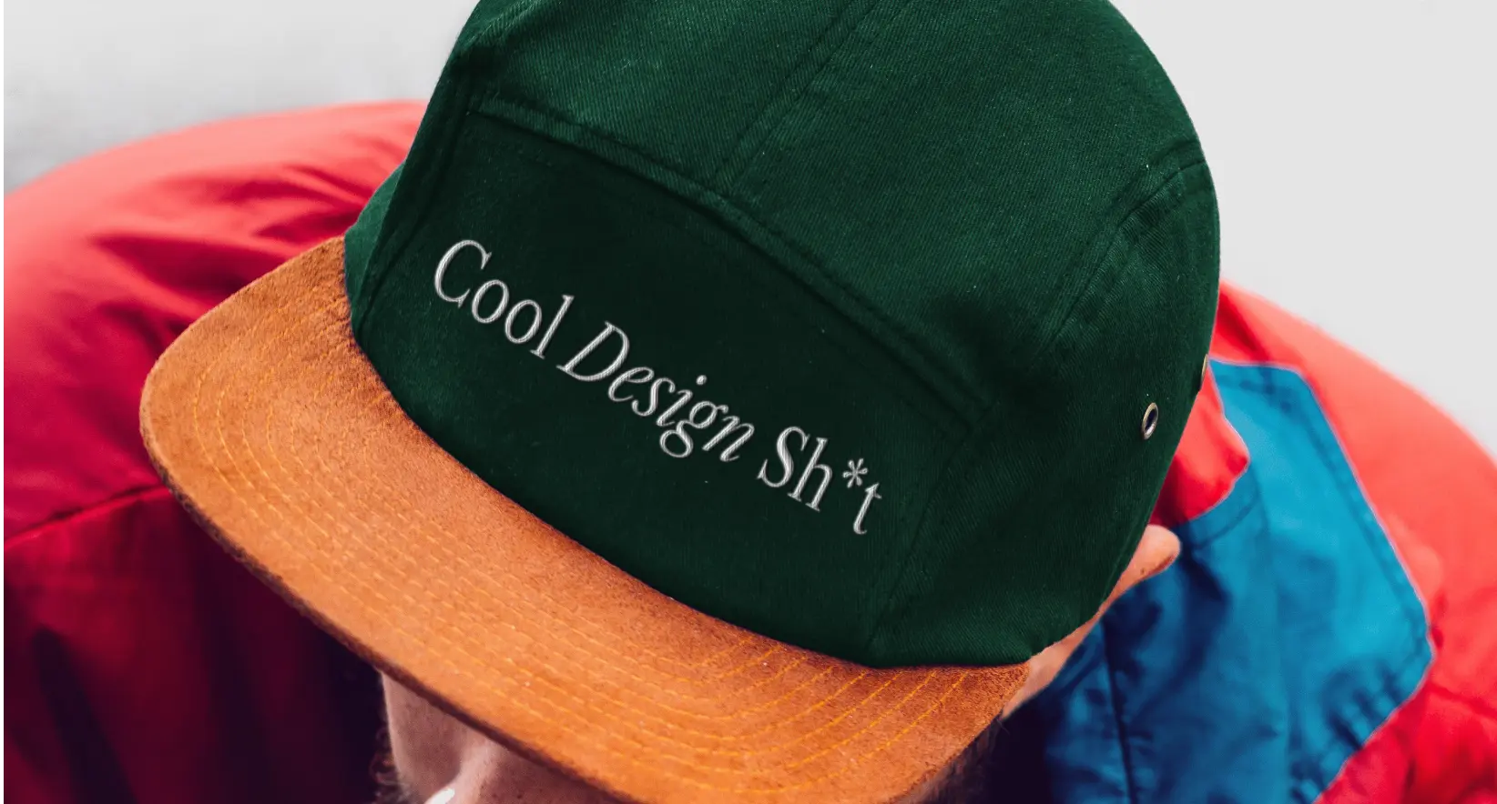
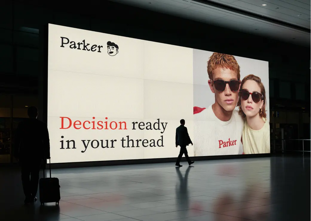
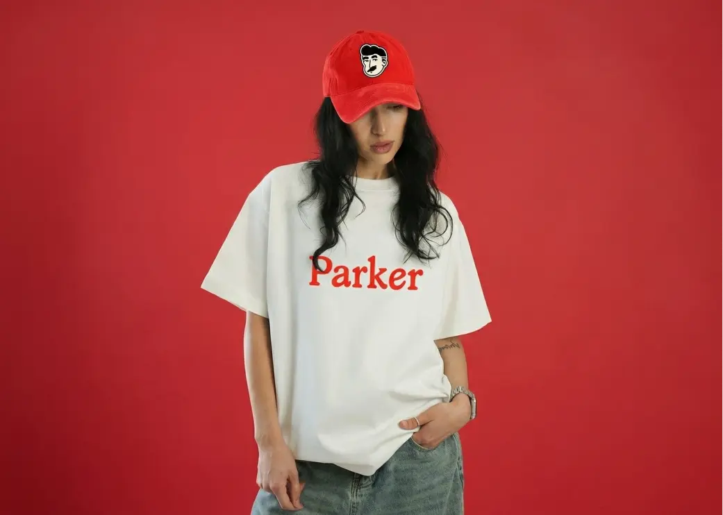
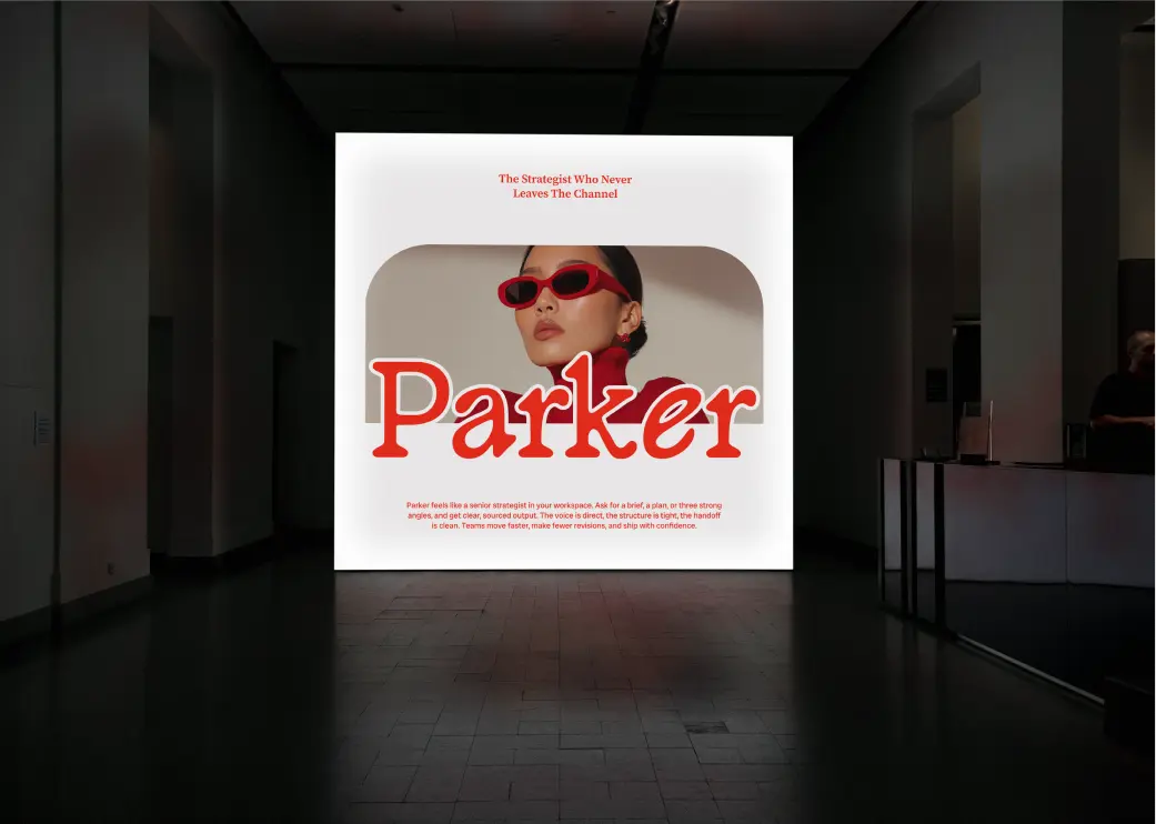
Parker had to feel like the strategist in the room, not the software. We pulled the identity away from SaaS entirely — bold display type, electric yellow, streetwear energy — building a brand that creative directors and media buyers would actually want to put on a t-shirt. Personality was the whole brief.

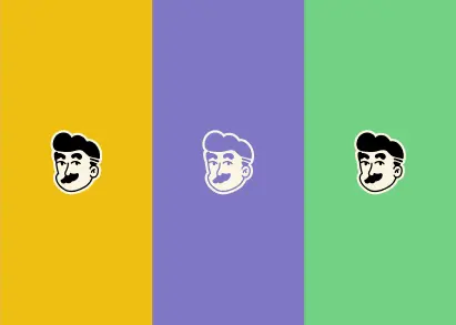
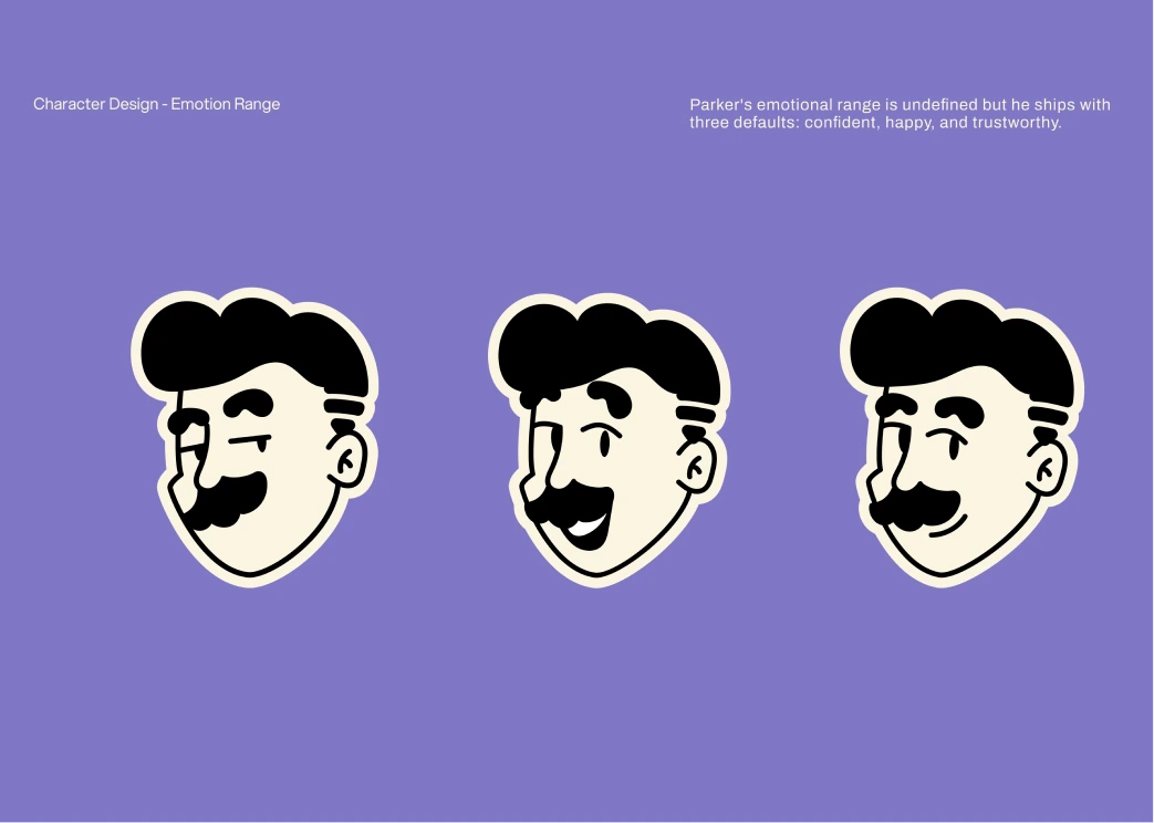
The illustrated character system gives Parker a face — literally. A cast of expressive figures that carry the brand across product UI, social content, and merchandise without ever needing a photo shoot or a stock library.
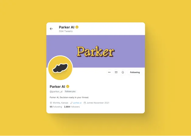
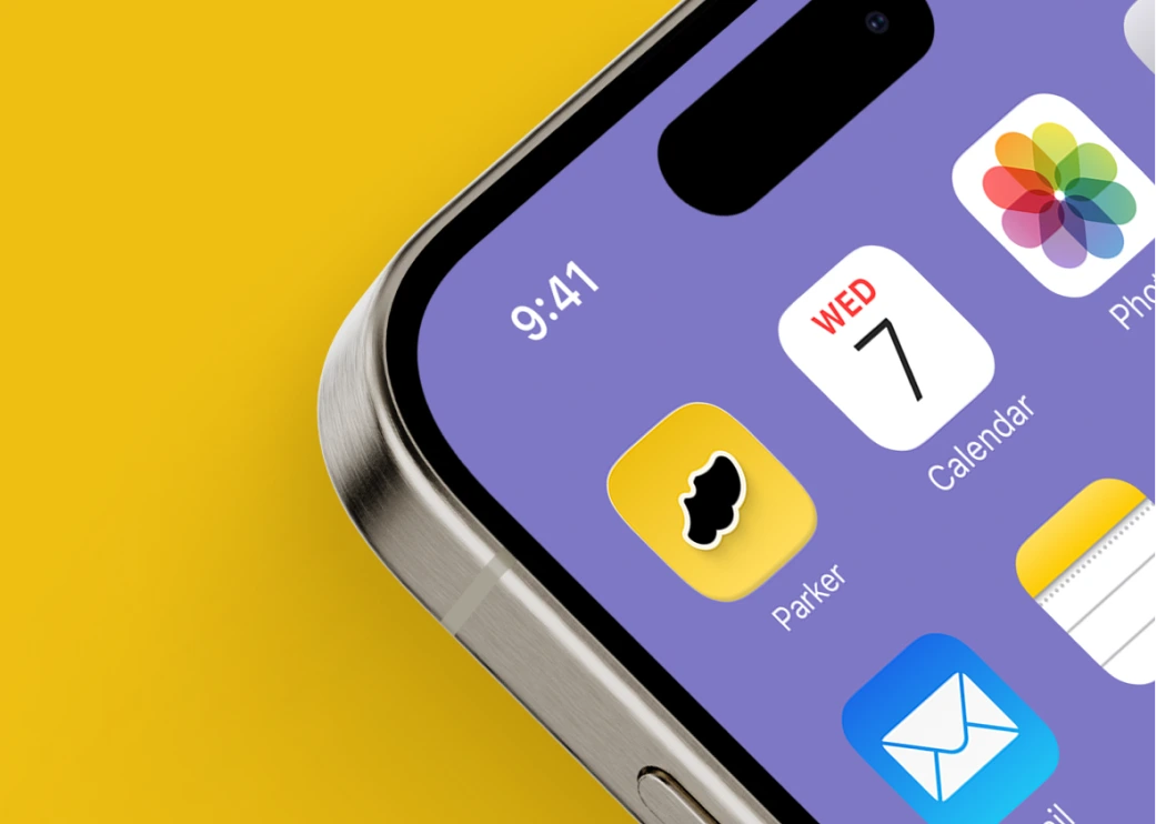
Yellow was chosen to own the feed. In a category of dark dashboards and sterile SaaS interfaces, a single saturated color does more work than a full brand overhaul. Parker stops the scroll before the copy even loads.
Creative Process
We opened with a deep audit of the DTC tools and AI SaaS space — and found a category full of products that looked identical. Parker's advantage was always its personality: built by people who actually make ads. The brief was to make that personality impossible to miss, starting with the name treatment and working outward from there.
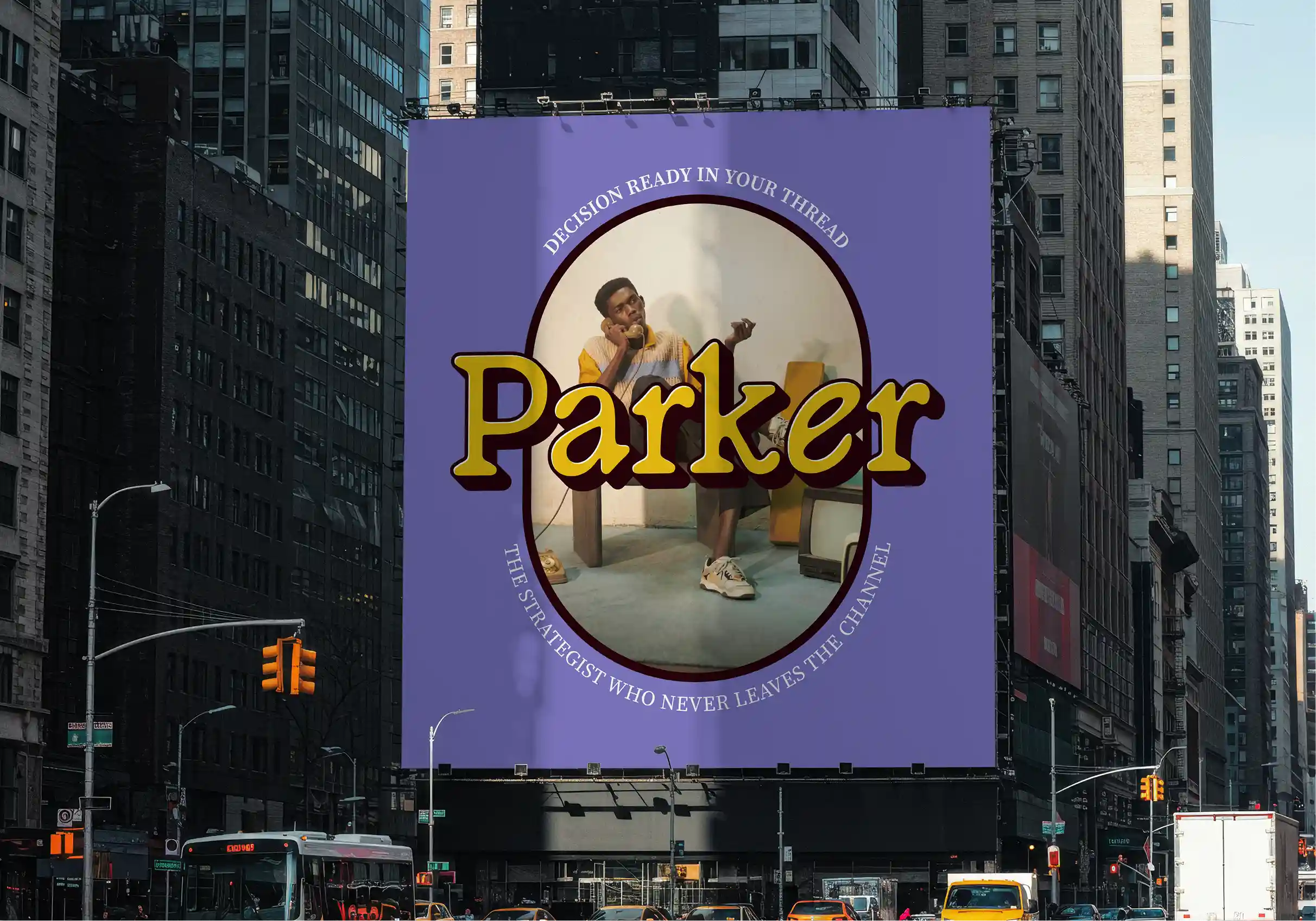
Identity, illustration, and UI design language were developed in parallel — each element pressure-tested against the places Parker actually lives: product screens, Slack channels, OOH, and branded merch. The result is a system that scales from an app icon to a billboard without losing an ounce of character.